An Overdue Collab

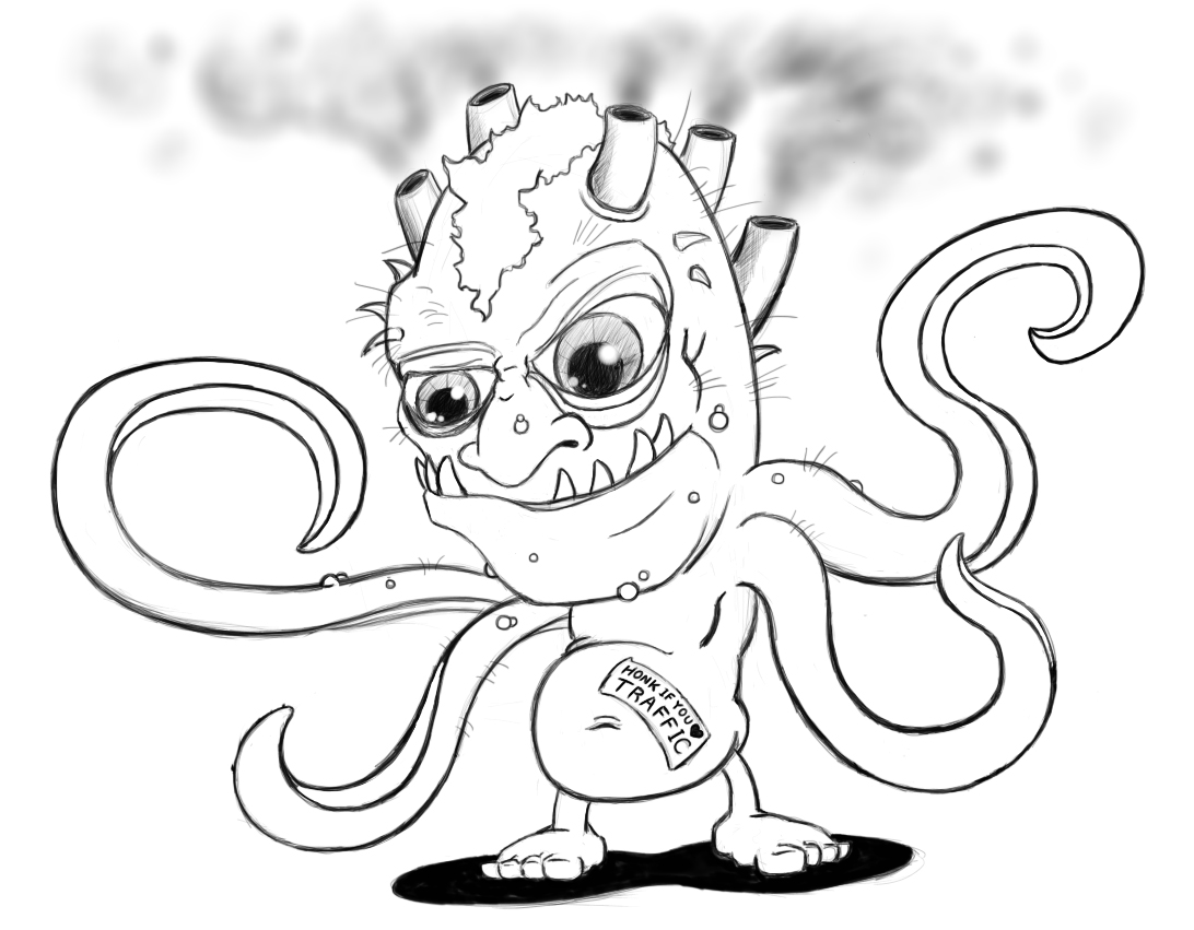
Original Sketch by Joe

When an old friend reaches out and wants to collaborate on a project, you say absolutely! This is exactly what happened. Near the end of November last year, my old friend from high-school, Joe, reached out to me for some creative help. He had been away with the United States Air Force, and U.S. Marine Corps. While he was serving he was inspired to create this character, Greta. He had a sketch of her that he had done and was curious if I would be interested in lending him a hand in taking it to the next level. Joe and I were pals in high-school and we both had a passion for drawing and art. So when he approached me with this request, it made sense, and I was happy to help.
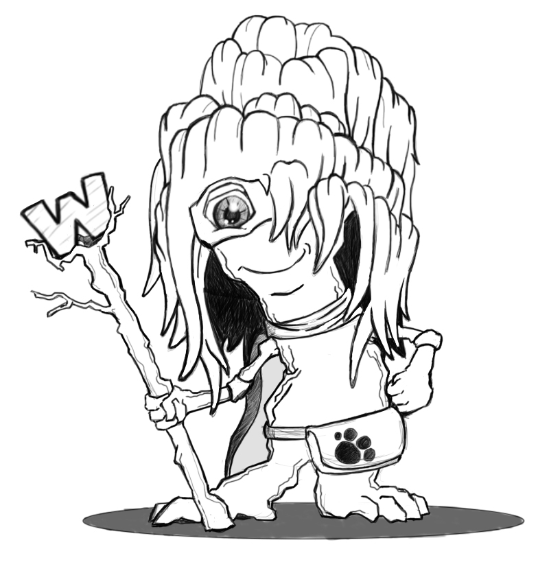
Vector Outline

Joe wanted to have his sketch tightened up and of course, colored. He wanted to have this illustration readily available to possibly place on t-shirts or maybe stickers. With that in mind I told him the best approach would be to vectorize the illustration. This way we can easily change colors as needed and resizing it would not cause any issues. Joe was on board and excited to see what I could come back with.

Final Vector Illustration

I began to vectorize the entire sketch. I outlined the entire thing in Illustrator CC starting with a black outline layer, cleaning up the lines and filling in the details that were lost on the sketch. Joe had previously given me a few images to reference for color. After a few rounds of revisions and some color adjustments the final product emerged and Greta came to life. Joe was thrilled with the outcome and it felt great to be able to work with an old friend.

I think the illustration came out solid and has great potential to be incorporated into future projects. I added the typography and background to dress it up a bit. I'm not sure what else Joe has in mind for her but I would be happy to help. He did promise me a t-shirt as soon as he gets them made

Gettin' Funky with SUZE

After designing his personal business cards last year Adam McKinley approached me with another project. His band SUZE, in which he had been a member of for over 10 years, had changed their line-up. He was basically looking for a new, fresh look to accompany this change. The band was moving full-steam ahead, writing new music and booking some upcoming shows. The first thing he wanted done, was a new logo. His current logo at that time (picture to the right) needed an upgrade. He was looking for more of a wordmark logo similar to Led-Zeppelin, KISS, AC/DC etc. Other than that guideline, I had full creative discretion. After talking with Adam about the history of the band, it’s current standing, and looking towards the future, I felt it was important to build off of his past logos, and pull inspiration from those, just as they were doing as a band. Using the antique car as my main point of inspiration I put together a few versions to give Adam an idea of the direction I was moving in. He was thrilled that I was able to incorporate the car into the design, and was pleased with outcome. After a few tweaks back and forth we developed a brand new logo for SUZE (shown below).

Now, armed with a new logo, we hit the ground running. A photoshoot and a website was next on the agenda. Both of which went off without a hitch. My photographer was able to get tons of stuff for the site. Adam and his bandmates are a blast to work with. We even got a little taste of funk while sitting in through a small rehearsal after the shoot.

Since then, things continued to move forward for these guys. This past May was SUZE’s 10 year anniversary at the Kirby Center in Wilkes-Barre Pa. We put together a media campaign to announce the show. It had a tremendous turnout and we were able to grab some excellent photos while attending. I see nothing but good things ahead for these guys and I am incredibly happy that I have the opportunity to work with them. If you have a chance head over to their site at SUZEROCKS.COM and have a listen. You’ll surrender to the groove in no time!

Or Check them out right here, playing live this past FEB 17th at Sarah Street Grill.

Superparks, Super fun.

This was definitely a fun project to work on. It was also great opportunity to work with some awesome people. 

The Superparks job came to me through word of mouth. A co-worker had recommended me to Nick Sufrinko and Michele Schasberger. They were looking for some illustrations to accompany an active-lifestyle campaign he and his team at Keystone Active Zone had been putting together. Their vision was to promote Northeastern Pa's notable parks and recreational areas with a fun and playful approach that would prove memorable.

The direction they provided me with was to create 4 superheros and 1 supervillian. Each of these characters were to represent a state park in the area of Northeastern PA and the villain to represent the things that would cause a person to be less active. I hit the ground running with some digital sketches (pictured above). After several meetings and some changes we eventually were able to finalize the characters (pictured below). The bottom line was to have 5 solid characters to hand off to Nick, which he would then use to incorporate into a website he put together. Be sure to check out their site! SUPERPARKS.ORG

Friends with Benefits

It's not very often you come across a good friend or partner that you can count on. More often than not your general "friends" or "significant other" turn out to be flaky and overall are pretty selfish. Fortunately for me this was not the case.

I want to throw a huge

Thank You

to my girlfriend, best friend, and teammate, Kimberly Gumaer!

Kimmy G

She's my go-to photographer and she really helped me out this weekend. Not only did she go out of her way to give me a hand, but she did a tremendous job! She's more talented than she gives herself credit for, in all aspects of her life!

Check her out for yourself...Kimberly Gumaer @ Delicate Touch Photography

Thank you for being amazing!

Designing with a buzz

So as I was going through some of my older design pieces and for the longest time I really wanted to revisit this SKYY Vodka campaign. I always thought that it was a great idea. I just felt I wasn't able to flesh it out as clean as I would have liked to.

Armed with a fresher sense of design, and a more mature eye, I set out to revisit these drunken advertisements.

I like to call this the SKYY Vodka "Taste" campaign. Below are the revised ads. The idea behind this series is fairly apparent, but I will explain anyway. Each ad in the series will display the SKYY vodka bottle next to a signature cocktail. Depending on what that drink is (a tropical lemonade) the bottle will be wearing some sort of accessory (a grass hula skirt) to set he scenario of wear that cocktail may be consumed. And of course, the SKYY portion of the logo will display a coordinating color.

It's funny how little tweaks and a lot of experience can really shine through on a simple design. The new series looks cleaner and cohesive. It really catches the eye. Bottoms up........

For the love of MONSTERS

I'm not sure if I'm going through a phase or if it is just my overall love for creepy and scary things, but lately I've been doing a lot of monster art. I think I noticed this after I had one of my "future project brainstorming" sessions. That is where I sit down and usually fill up a page and a half of notebook paper with either things that need to be completed and things that I would like to start. As I completed this past list is when I realized that I had a monster issue. As of right now these two are the first of the series. We have Crummy the Mummy to your left, and to your right, allow me to introduce Francis Stein.

Among the list of "things to do" here is what you all have to look forward to! There will be a male and a female zombie, a mad scientist, the Bride of Frankenstein (both as a cartoon and a painting from the 1935 version to accompany my Karloff version), and a Nosferatu. It should be interesting! I hope you enjoy!

He's Alive!

I love this image of Boris Karloff's Frankenstein Monster! Although I saw the movie in black and white I really wanted to capture the grittiness of the old film as well as add some popping color to bring it to life. I just couldn't go wrong using the lime green for his skin! I think the bright colors, heavy contrast, and halftone pattern in the background give it an old comic book vibe, which I'm totally fine with. For the whole piece I used spray paint and acrylic on plywood to get this monster to come to life! I think the added typography was a nice touch. As for all you cinema monster enthusiasts...I know the monsters name was never Frankenstein, but this one is!

Turtley Enough for THIS Turtle Club

One of my previous supervisors ( Peter Steffen) got in touch with me to create a logo for his business.Pete had a vision for a frozen yogurt shop. He wanted to create an entire beach/surf bum themed shop that bring the frozen yogurt experience to the next level. Knowing I had been in graphic design, and had a background with illustration, he approached me with his vision  and his idea for a logo/mascot. I picked his brain a bit and after a few sketches, and revisions on my end, I was able to create the face of the Tasty Turtle!  Pictured on the right was the approved drawing before I went digital.

Here are the two versions of the logo I created for Peter. It really is a great experience to see someones vision realized on paper(or computer) and the excitement they have when you, in some way, were able to take their thoughts and produce something physical from that brainstorm! If you're local to the Wilkes-Barre/Scranton area and you are looking for a great place to chill out and enjoy some frozen yogurt...Tasty Turtle is the place! Check them out on Facebook! Tasty Turtle

This Pop-Up is Madness!

So this project was done a while back but I would just like to share it again because...well...it's awesome! I was thinking about movies that were done before this 3D movement and which ones would look awesome if they were redone with that effect. The movie 300 would without a doubt definitely look amazing in 3D. This got me thinking about a special edition DVD promoting the 3D version. I thought including a pop-up card with the DVD would be a great idea, and so I created one. I have never done a pop-up anything before so I had to watch a few videos on creating pop-up books. I even bought one just to dismantle to further my understanding of the mechanics. After a few trial and errors, I was able to create the functioning comp pictured below.

After perfecting the mechanics and artwork I wanted included, I then needed to dismantle it and decide how things needed to be created digitally. This was a bit difficult to visualize because the comp was created totally by hand and pretty much winged it! After some more trial and error and multiple prints as well as complete disasters...I got it!

All of the illustrations were done in Adobe Illustrator with the basic shape. I then took each illustration into Sketchbook Pro and added all the detail. The best part about this pop-up is the side tab. After you open up the card you can pull the tab and the spear slides out toward you! I'm really happy that I was able to get that function to work well.

Team Tee-Shirt Design

Last Summer I snagged a small freelance job to create a design for the front of tee-shirts. G.R. Noto is an Electrical  Construction company and it's employees were participating in a Leukemia and Lymphoma walk. The Administrative Assistant there contacted me and shared her thoughts on the design. After a revision or two we finalized the design.

Local Musician Show Poster

Other than drawing, painting, and  designing I do love music. Now, as far as my musical talent goes...I can whistle, but thats as good as it gets. I love LISTENING to music is what I should have said, and I love the amazing places it takes me on a mental level. I also jump at the chance to help local musicians promote themselves. It's a great feeling to help fellow artists of any genre experience a level of success! Dustin Douglas is not only one of these musicians he is also a close friend! So I usually get the chance to pick his brain and create a kick-ass poster every time he has an upcoming show! Here is the latest poster I created for his show coming up on the 25th of April. If you interested or would like to know more, contact him through his website dustindouglasmusic.com

A few months ago, I also helped him put out his latest CD, Black Skies and Starlight Check it out!

NFCS Robotics Logo Design

My cousin works at New Foundations Charter School (NFCS) and he heads up a robotics class that does tournaments every year with the robots they design, and create. Last year he came to me with a freelance opportunity to design a logo for his team which would then be used to screen on tee-shirts, sweat shirts, etc. I of course jumped at this chance to design something awesome. His first request was to create a bulldog logo, based off of the schools logo which of course was also a bulldog. The team also joins tournament which require the robot to function underwater, so he also requested a version of the logo be water themed. Above is last years design!

This year he ended up heading two teams from his school. He coached both a middle-school team and a high-school team. The request this year was to do another two logos as well as  graphics that would display the corresponding numbers to each school section. Above are the final versions of both logos I created. The logo on the left was designed for the high-school team with a more serious look and feel. On the right is the middle-school design. Its got more of a playful vibe to it. Pictured below are the number graphics I created to signify both teams.

Towards the middle of March his teams entered into a new robotics tournament in which the robots they will have to create must be able to either fly, or function under water. So now the team wanted two bulldog graphic that signified these aspects, and as always I was up to the task! Below are the final versions! I am extremely happy with how well these turned out!

Sadly, these will be the last graphics I create for them for a while, but don't worry! They are going to get these printed on tons of cool merchandise that I will give some sneak peaks of from time to time!

Help Fund The NFCS Robotics Team Today!


Latest Dog Portrait: Emma

This pup was the latest in my commissioned pet portraits. She proved to be a bit harder than my last two. I really haven't worked with those deep dark tones. Layering the lead was definitely the key. It was also a challenge recreating the eyes. As you can see, the photo I was going off of gave her red eye. What I ended up doing was looking up images of similar dogs with their head at that angle, and trying to recreate that glare. Overall I am absolutely ecstatic about the way it came out, as was Emma's owner! And THAT, is what will always keep me going!